Create Your First Project
Start adding your projects to your portfolio. Click on "Manage Projects" to get started


ED RUSCHA / NOW THEN
location
museum of modern art, nyc
date
september 13, 2023
ed ruscha's NOW THEN at the museum of modern art is the single largest retrospective of ruscha's career, with over 200 works included in the show, including paintings, photographs, prints, books, drawings, film, and installation. surprisingly, this is the first solo exhibition that ruscha has been honored with by the museum, despite being a prominent artist for decades in the permanent collection.
i have always loved ed ruscha's work (think rew-SHAY), probably because of a mix of the bright colors, conceptual representations, wide breadth of mediums, and, perhaps most of all, his deadpan sense of humor and witty wordplay. and that doesn't even mention my feelings of personal connection, as we both grew up in oklahoma city, albeit with a sixty-year generational gap. but his view of the midwest (or southwest, however you envision oklahoma geographically) and the unique position that a kid from oklahoma can develop their perspective of the world from. this is truly one of the best solo artist retrospective exhibitions i have ever had the pleasure of experiencing, and i highly recommend getting over there to see it before the show closes.
on view now at moma, runs through january 13, 2024


This is one of Ruscha's earliest drawings, reflecting his Oklahoman identity. Born in Omaha, Nebraska, in 1937, Ed Ruscha moved with his family to Oklahoma City at the age of five. Most of Ruscha's formative years took place in Oklahoma City, living there until the age of 18, when he moved to Los Angeles to attend the Chouinard Art Institute (now the California Institute of the Arts, or CalArts). Combined with his love for cartoons, this sketch shows Ruscha's constant harkening back to his childhood roots, as this was drawn just a few years after he moved to LA. The Sunday Oklahoman newspaper can be seen in the pencil-sketched comic strip. While it has never been clear what the "E" represents, many assume it stands for Ed, the comics-loving boy from Oklahoma City.

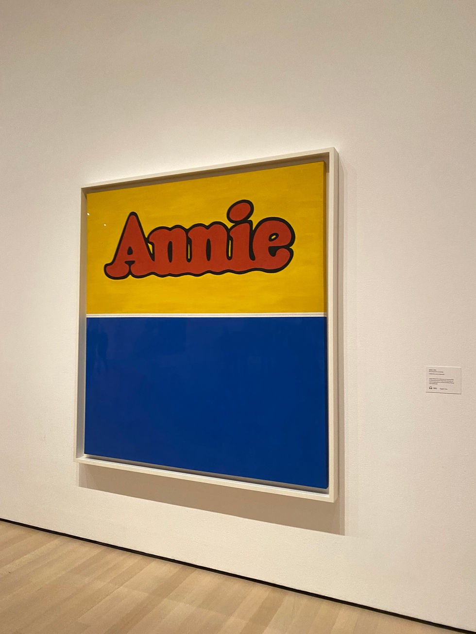
In Ruscha's early career, he showed interest in marketing and advertising, before eventually settling on art school to develop his skills in painting, drawing, and printmaking. He was introduced to cartooning early in his life and was influenced by comic strips and books throughout his career.


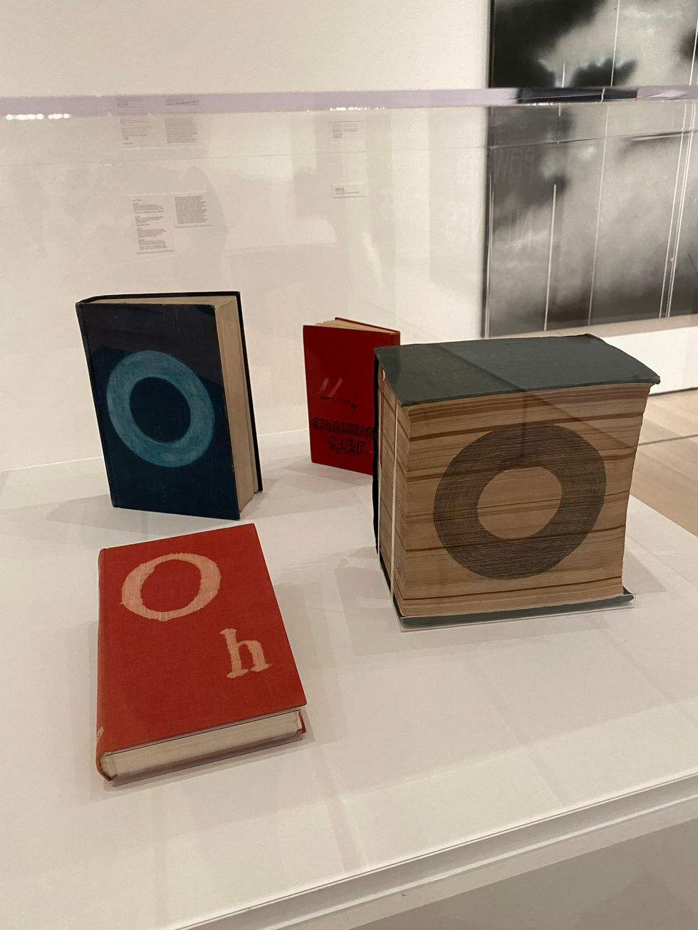
The first of Ruscha's artist books, Twentysix Gasoline Stations, is exactly as it presents itself. Ruscha says the title came to him even before the photographs were taken. He was fascinated with the odd specificity of the number twenty-six, a clear indicator of his dry humor. The 26 photographs were taken on the many trips that Ruscha took using the Route 66 highway, connecting Los Angeles and his hometown of Oklahoma City, where his parents still resided. Ruscha's distinct style that separates him from many other fine art photographers was his clear emphasis on documentation rather than composition. These concepts of factual records are more important to the artist than its actual visual details. Ruscha's first book immediately set a precedent for the following handful of artist books.


Ruscha developed a knack for repurposing his own work into new artistic forms. He has a substantial amount of graphite drawings of his artist book covers.


Ed Ruscha's unique accordion-style book, unfolding to almost twenty-five feet, visually lays out both sides of a mile-and-a-half stretch of Sunset Boulevard in Los Angeles. Laid flat, the two continuous images face each other, with each building labeled with its address number. Ruscha and his team tediously developed a mechanism that allowed the film to feed though the motorized camera in order to continuously shoot. He liked the aggressive architectural work that was happening in Los Angeles at the time. He was fascinated with how horizontally spread out Los Angeles was, and the idea that it was now (in the 60s) primarily a driving town. In an interview with Ruscha for the museum's retrospective, he says "I felt like it should be recorded with no prejudice, with no agenda, and no moral. I mean, it’s just like copying something for what it is."

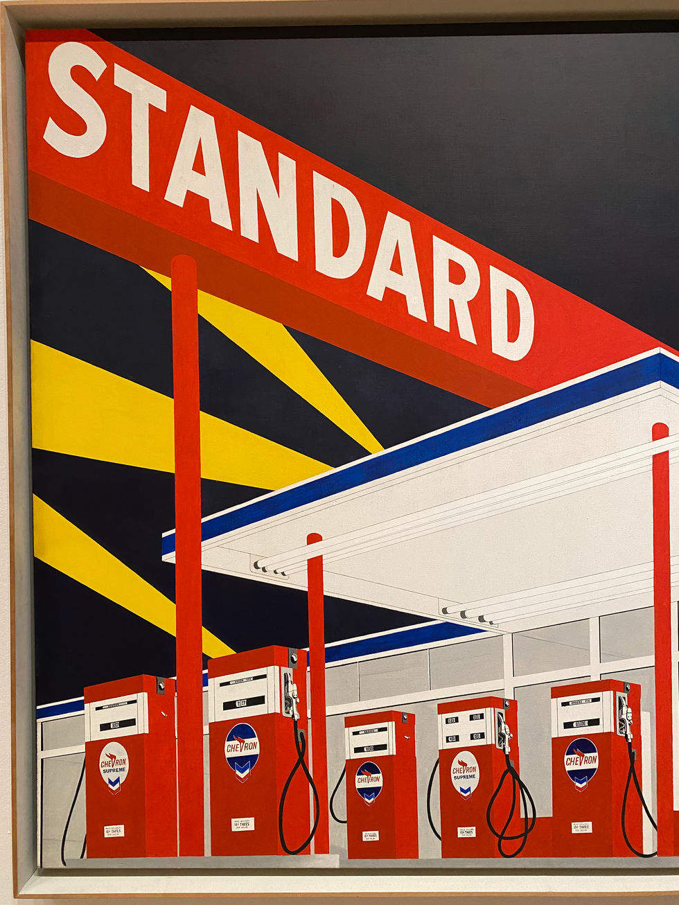
(partial view)
Ruscha's constant travelling between Oklahoma and California spawned many of his creative ideas, using a lot of what he saw on the road as source material. The quietness of driving and the vast emptiness of the horizon gave Ruscha the perfect blank template on which to visually develop his ideas. This particular Standard gas station, based off of a photograph Ruscha took of the real station in Amarillo, Texas, was reproduced many times in various forms.


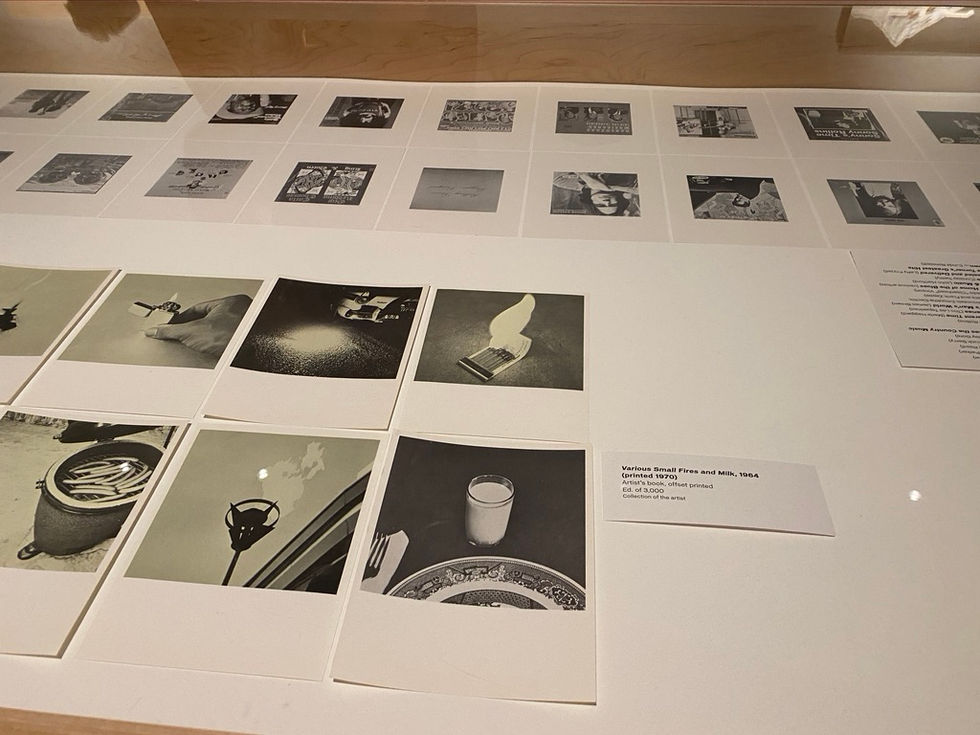

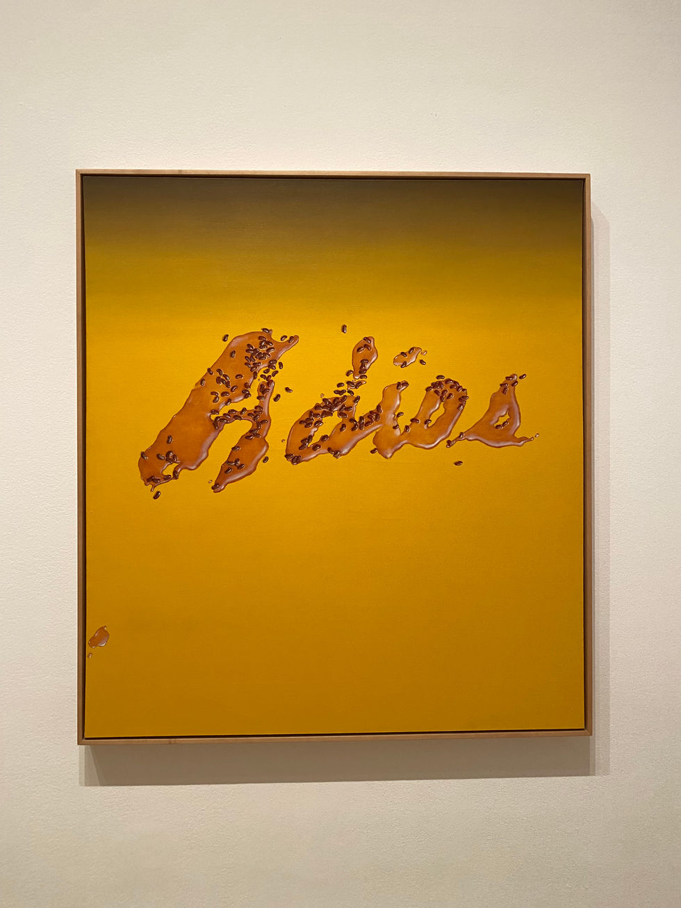
Ruscha has made a career of painting and drawing words with more ambiguous associations. This unusual word is made even more cryptic by its representation in trompe l'oeil letters that simulate liquid. The work belongs to a group of canvases Ruscha made during what he described as his "romance with liquids."


Ruscha continued to add to his collection of small and cheaply made, mass-produced photography books in 1968, with his first book of color photography. Ruscha appreciated the inexpensive nature of the book, expanding its availability to the general public: "All my books are identical. They have none of the nuances of the hand-made and crafted limited edition book." Ruscha's "Nine Swimming Pools," in addition to his three previous publications of the same format, all envoke the crowded, densely populated sensation of Los Angeles, without the physical presence of humans in the work. Ruscha continued to stretch the pre-defined boundaries of what it meant to document the landscape.
After nine deeply saturated blue swimming pools, each one on its own page, the final page is a color photograph of a broken glass. The picture is unclear, blurring the glass and the blue floor together, an anxious feeling of impending danger.

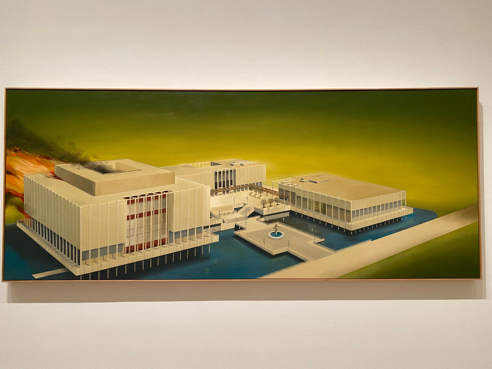
The Los Angeles County Museum of Art opened their doors to the public in 1965, the same year Ruscha began work on this large-scale painting. To study and prepare for the painting, he took aerial photographs of the museum campus from a helicopter to acquire an accurate visual perspective. To let Ed describe it himself: "About this time that I was painting this picture, I had some, oh, maybe personal gripes about the art world in general. And I felt like the museums were not really doing their jobs as far as opening their doors to contemporary art.

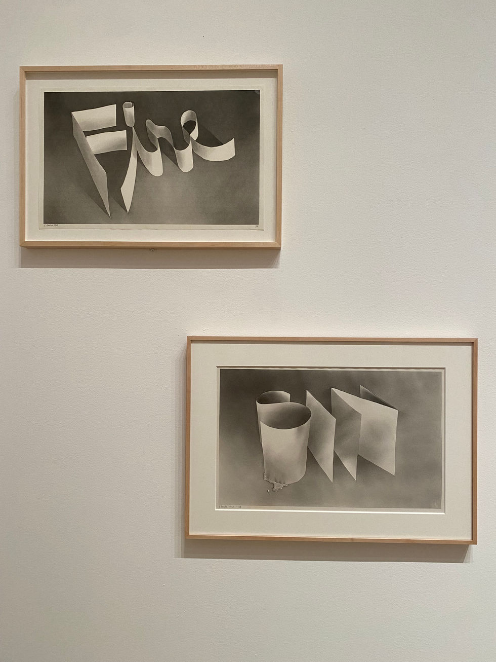
In the 60s, Ruscha started experimenting more with new ways of rendering words. He discovered that he could soak gunpowder pellets so that after they evaporate, he could use the fine powder as a smooth, smokey drawing material. Ruscha's ribbon words have a sense of movement and optical illusion that had not previously entered his repertoire from previously working with block letters.

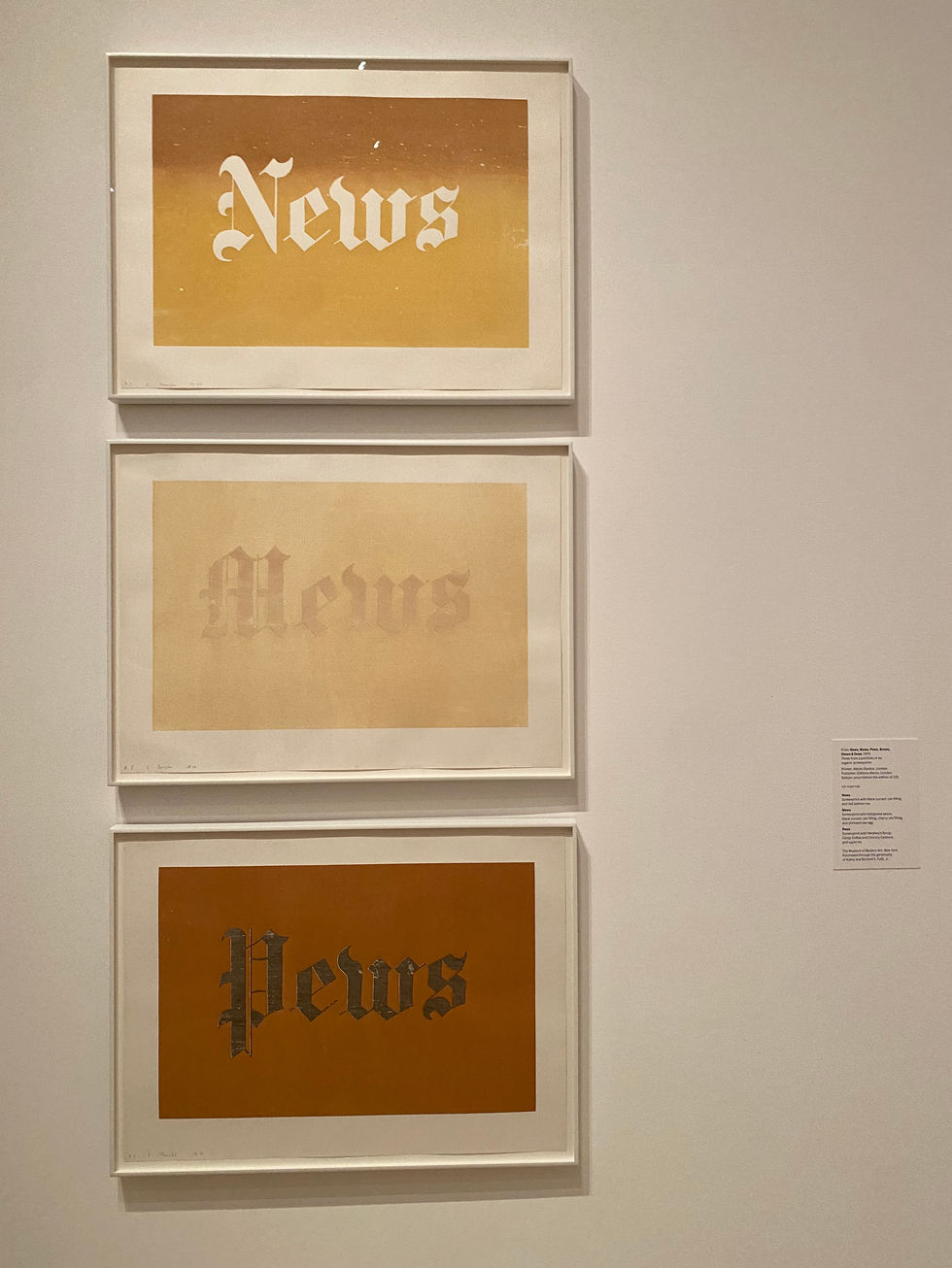
These three words, part of a series of six originally entitled "News, Mews, Pews, Brews, Stews, Dues," summarizes Ruscha's attempt to define 'Britishness.' Ruscha says: "News means that England is a tabloid-minded country. Mews is a little alleyway found in many towns. Pews is Westminster Cathedral. Brews refers to English beverages – beer, stout, ale. Stews is my idea of British cooking. Dues is the story of Robin Hood, unfair taxation, the British protest." He also used organic materials for this work, including red salmon roe, Bolognese sauce, raw egg, squid in ink, chocolate syrup, caviar, baked beans, chutney, daffodils, tulips and axle grease.


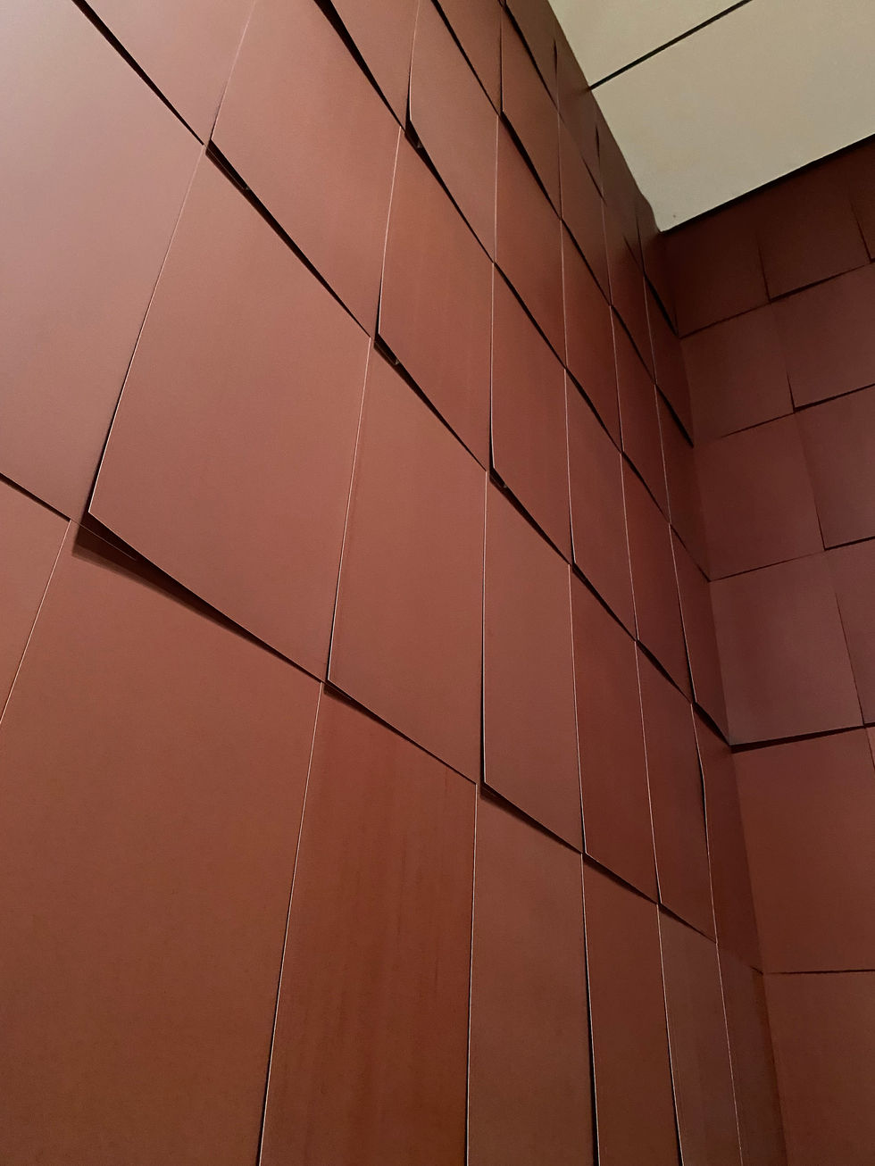
Ruscha first produced Chocolate Room while he was in Venice for the Biennale in 1970. He ends up seeing little metal tubes of Nestle chocolate paste that remind him of the metal tubes for his oil paints, and so he decides to use chocolate, screen printing that chocolate onto hundreds of sheets of paper and tiling those sheets across all four walls of a room. The work has to be remade every time it is exhibited, which truly emphasizes the fact that it is real chocolate. It is very different from ink because the sugar makes the chocolate thick and heavy. Not to mention it melts at a very low temperature. The room's fabricator for the show, Edan McPherson, says: "We actually do the printing in the space, because if you were to print it somewhere else and send it, it wouldn’t hold up. You can’t even put your hand behind it, because it literally melts the chocolate." The organic nature of the material means that the work will inevitably change over time. The gallery's climate control is crucial to the room's ability to last the entire 4-month run at MoMA. The very existence of Ruscha's Chocolate Room pushes the optimistic notion that anything is possible.

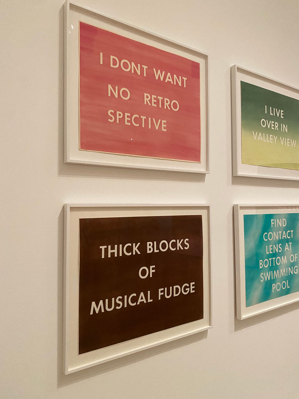
This series of word paintings is probably the strongest example of Ruscha's genius yet ironic wordplay, once saying, “words have temperatures to me, and when they reach a certain point and become hot words, then they appeal to me." The specific relationship to the visual characteristics of words and their silent musicality inside the viewer's head. Color, texture, shape, size, font, and case all influence the sounds of words and phrases, without much thought given to that idea at all in one's day-to-day life.


Ruscha's nostalgic memories of going to see black and white movies as a kid in Oklahoma influenced his development of his series of film paintings. His fascination lies on the materiality of film itself, focusing on scratches or dust specs that are part of the celluloid surface. In this painting, The End, the title is split horizontally, as if there has been a malfunction in the projector. The palpable feeling of light and motion pulls in the viewer. Ruscha always enjoyed the pops and scratches that came along with watching a physical reel of film, and even though the movie producers and creators would have wanted them out in order to have a more perfect finished product, Ruscha liked them as they were. Ruscha interrupts the illusion of continuity, illustrating an out-of-sync moment in the natural viewing of film. The title and subject of the work is a reminder that time is only momentary, and endings mark new chapters in the eras of time.


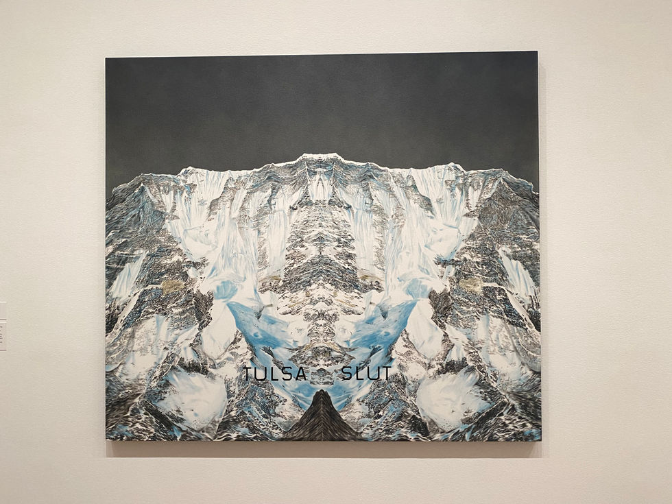
This is one of my favorite pieces, especially because it is so defining of Ruscha's later work. His fixation on the opticality of text rose to its full height in the year 2002, a palindrome. Hyper-focused on the perplexing year, Ruscha made ten large canvases using palindromic phrases. The artist's "mirror paintings" place symmetrical text on top of a rorschach-like mirrored mountain. The duplicated image is a visual representation of the text. One could also see Ruscha's influences from the movies, as many of his mountain range word paintings resemble Paramount's logo and opening credits. In addition to "Tulsa Slut," palindromes include "Sex at Noon Taxes," "Solo Gigolos," "Never Odd Or Even," "Lion in Oil," and "Porch Crop."


"Pay Nothing Until April" is classic Ruscha wordplay, always developing strange phrases that are typically never strung together in normal life. Each word has a visual and auditory quality, giving each word its own separate line, perfectly centered. Ruscha developed his own typeface, called "Boy Scout Utility Modern," that he laid over the mountainous landscapes.

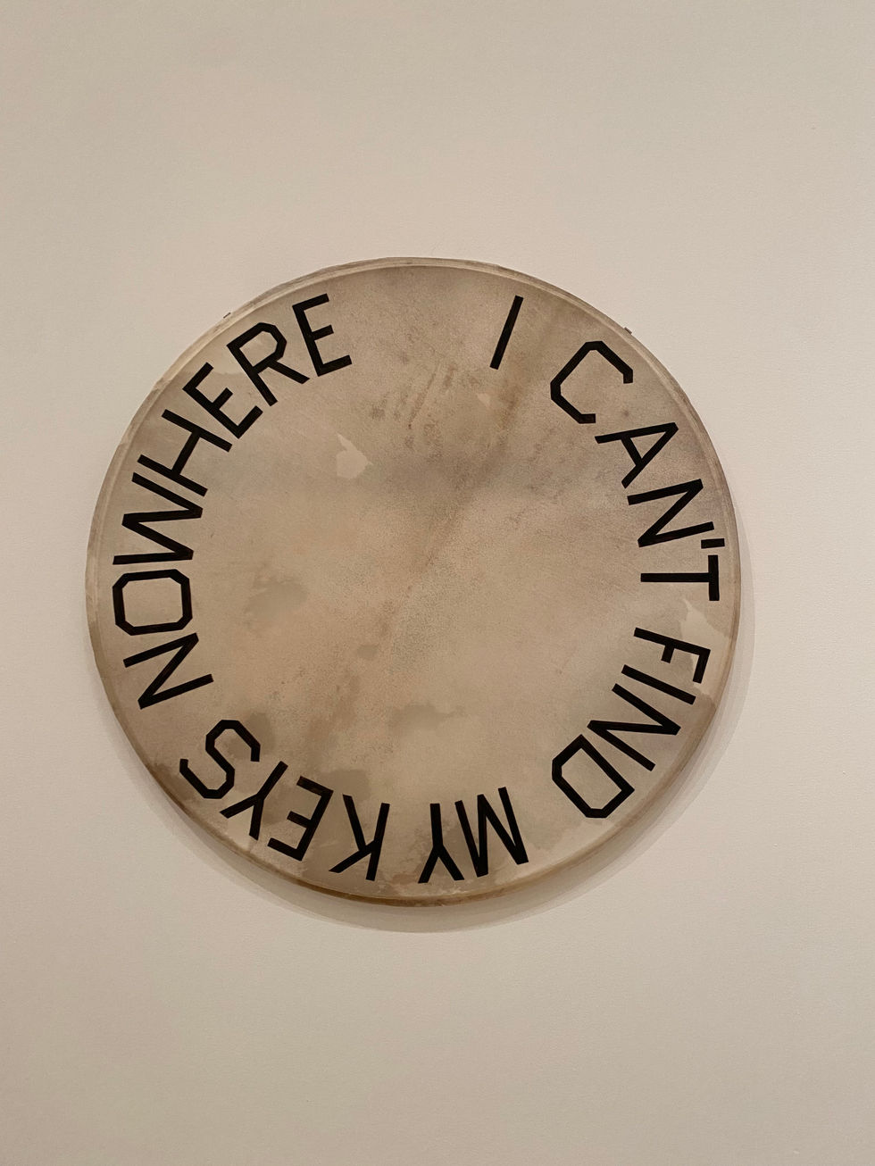
In one of Ruscha's most recent series, the artist paints distinctive Oklahoma slang onto found drumheads that he has collected over the past forty years of his career. Made between 2017 and 2019, the phrases used by Ruscha include "I Ain't Telling You No Lie" and "I Never Done Nobody No Harm." He adds: "I grew up with people that spoke this way.… I was very acutely aware of it and amused by it. It seems like you’d run from incorrect English, but I embraced it. I like seeing it and exposing it."